

On the list of reasons that I like Infinity, the second biggest (following respectfully behind SPACE BUILDINGS, which will forever be first in my heart) is the quality of the model range. Corvus Belli’s minis have a level of dynamism and a clarity of design that I just don’t see in most other gaming ranges– every model is doing something, and the models are covered in details that feel planned-out and somewhat plausible.
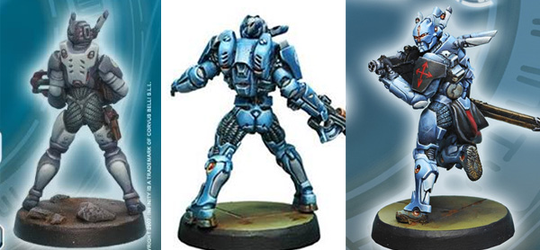
However, this was not always the case. If you go to any of the faction galleries on the Infinity website and scroll down, there is a sharp distinction that occurs between the top 2/3 of each faction’s models and the bottom 1/3. Namely, that the old models are just awful. The designs are very bland, the poses are bizarre, and the sculpting quality is very low, with very soft, round shapes instead of the sharp detail the range later came to be known for.
The reason for this dichotomy of model quality is simple: when Corvus Belli first published Infinity, they were a tiny company without a lot of money. They needed to pump out 100+ minis to get their game onto its feet, but the only way they could afford to do that was to hire cheaper (read: crappier) sculptors and have them burn through models very quickly without spending too long on each one. Fortunately, this gamble paid off– people weren’t turned off by the mostly crappy initial model range, which instead sold in huge volumes and rocketed CB up to “respectably mid-sized gaming company” status.
So once it came time to publish their first expansion book and to produce all the models that went along with it, they had all the funds they needed to hire the best sculptors and even to have them take their time. As a result, the models for from the latter 2/3 of the range are gorgeous, and only getting better.
However… those older models still exist. CB has been working over time to resculpt some of the most egregious offenders, and I have no doubt that they’ll all be gone 2-3 years from now; but for the time being there are a large number of in-game statlines for which your only option is to either proxy or play a crap model.
I managed to mostly avoid these old junk models when assembling my Space Marines, but given that I inherited about 1/3 of my collection from an associate, a few dodgy models did make it through. I’ve relegated most of them to my bits box (where they’ve selflessly donated weapons and limbs to benefit more deserving models), but a single one ran the gauntlet and ended up in active duty: the sausage-limbed Knight Hospitalier.

Behold his majesty.
The overall design of the model isn’t bad, but it’s really clear that the sculptor was in a hurry when he made it.
“Wait– why is that really obvious again?”, you ask.
Well, since you asked– it’s the general lack of raised detail. If you look at his left forearm, it’s essentially a cylinder with grooves pushed into it. This is a common practice among starting sculptors and converters– when you’re detailing a “tech-y” surface, it looks lazy if you just leave it flat, but it takes time and patience to sculpt raised details sitting on top of the flat surface. So, newbie sculptors will often just take a knife and press grooves into the surface to partition the surface into sections. When you’re doing tabletop-quality work, it does the job of creating visual interest, but you generally won’t find many pro sculptors who will put their names to that kind of work.
Now, with that said: I’m not saying that the person who sculpted the Hospitalier was a bad sculptor. Overall the work is very clean, and the anatomy and general proportioning are very skillfully done. Which is kind of weird, because usually sculptors need to get good at surface detail YEARS before they can progress to the trickier matter of learning good structure. This is why I’m pretty sure that rushed work was to blame– CB probably hired reasonably competent sculptors, but simply couldn’t afford to compensate them for their best-quality work (and all the time that would be required to achieve it).
CB did ultimately end up putting out a better Hospitalier model a few years later, but it represents a different armament configuration, so Ol’ Sausagefingers remains within the model range as a testament to CB’s humbler origins.
And since I didn’t want to drop fifteen bucks on the replacement model, I had to figure out a way to make him work. 🙂

And so it came to pass that Spud assembled the model and took a look to see what could be done. On closer inspection, I decided that most of the model was salvageable– everything from the waist down looks fine, and while the head is oversized compared to the rest of the knight range, the detailing on it isn’t terrible. The arms are really the only deal-breakers– he’s holding his Pringle can bracer forward for all the world to see, drawing attention to the flat surfaces. All I really needed to do was to spend an hour or two adding some extra plating and gizmos, and he could probably pass muster.
Ultimately I decided to crib designs from another model in the Knight range– a character Hospitalier made several years later:

This one is a high-tech Hacker with tech stuff embedded all over his gear, so some of the bits and bobs on his armor should be assumed to be custom additions that wouldn’t be present on other Hospitaliers. However, it was still a very useful reference– if I took, say, half of the extra shapes that are present on his outfit, that should be enough to break up the plain-ness of my Hospitalier’s armor.

Here’s my rough attempt. I copied the armor from the back of his hands, and noticed that some of the raised parts on De Fersen’s armor (like the little trapezoidal part in the center of my modification) correspond almost exactly to the smooth etched-in shapes on the old model, so I borrowed those as directly as I could manage.

I also added some “flex tubing” in the joints. One of the things I like about the Infinity heavy armor designs is how they acknowledge how difficult it is to get hard plates to “meet up” at joints without major sacrifices in mobility, solving the problem with either softer cloth areas or areas of tubing (which in the fluff contract and expand like muscles to help the wearer move around) wherever having the armor meet up would hamper movement. The flex tubing is visible on nearly all PanO heavy infantry wherever they need to bend on more than one axis (necks, armpits, palms of hands), but it’s easiest to see on the hips and butt:
The old Hospitalier completely lacks this type of flexible joints, so I added them myself wherever the problem areas aren’t conveniently hidden by cloth.

Once I’d figured out which shapes to add on the first arm, it was pretty quick to reproduce them on the other side.

And with those simple additions, the model goes from a depressing “OMG” to a stately “ehh, it’ll do”.
Hey, I can only work so many miracles. 😛
When it came to painting my Confrère Knight models (aka Knights of other orders than my primary Santiago army), I wanted them to still fall within the overall colour scheme of the army while having their own distinct markings. What I decided was this:
- All Knight models are issued standard armor– mostly purple, with white on their heads, shoulders, and one arm arm.
- On the other arm, each knight has the badge of his Order and a colour stripe corresponding to its heraldry.
- Over this armor, each Knight wears a cloth robe corresponding to the Order they’re stationed with– so if a Knight of the Sepulchre (which traditionally wears dark grey robes) is allocated to work with the Order of the Hospital, he’d put on their red-and-white robes for the duration of the posting.

So basically, this gives me an excuse to have the Confrère models fit into my overall scheme while still being distinguishable to my opponents. And as an added point of amusement, it turns out that my scheme actually looks BETTER on the side-Order knights than it does on my core Santiagos. XD


So, yeah. While my army is going to be focused mainly around Knights of Santiago and all of their Adventures in Space, there are other Knightly Orders present in the game, and I wanted to have at least one representative from each one (well, almost every one).
The Hospitaliers here are the oldest surviving order, and are dedicated to humanitarian works– they train as doctors, and work rescuing POWs, extracting casualties, and treating wounded. They’re very nice people. 🙂
By contrast, these next guys are somewhat less nice:


Teutonic Knights are based on a recently-discovered frontier world, and have fought for decades against the “weird creepy aliens” of the Infinity universe, the Combined Army. To understand what’s special about these guys, you need to know two things:
- In the Infinity universe, citizens of the wealthier nations are implanted with a back-up hard drive in their heads called a Cube. If you die, they can potentially extract your Cube, which contains a perfect image of your mind, and re-grow you a new body (though these bodies are a valuable commodity, so you need to be rich, well-connected, or perform great acts of service to the government or the Church to get one).
- The Combined Army are vastly more advanced than humanity, possessing technology we can’t hope to understand, much less reproduce. Of these, the most notorious is the Sepsitor, which essentially allows the EI to hack into cybernetic implants and take control of them. And since Cubes are directly integrated into the human brain, controlling a Cube lets the Combined Army control your entire brain. That’s right: they have a mind control weapon, and in the fluff, no way exists to reverse it once it takes hold.
Every citizen of PanOceania has a Cube implanted at a very young age. However, the Teutonic are engaged in a constant war against the Combined Army, where the presence of Sepsitor weapons is a standard assumption. Since they have no way to counteract it, they take the only protective measure they have: removing their Cubes on induction to the Order. This makes Teutonic Knights immune to mind control, but it also means that if one dies, he’s dead. Like, dead-dead.
As a result, this order attracts only the fiercest and most passionate Knights, who fight with wild abandon because they accept that their careers are going to be short either way.


This gorgeous model is a Knight of the Sepulchre, which have a much simpler background: they’re awesome. Basically, if you’re a knight and you impress the crap out of your superior officers on a regular basis, they might recommend you for a transfer to the Knights of the Sepulchre, which are among the best-trained, best-equipped warriors in PanO.
Oh, and they’re fully aware of all that, so in the fluff they tend to be written as smug assholes. 😛
Scheme-wise, I did the Sepulchre knight a bit differently than the other Confrère Knights– since the Order of the Sepulchre is a merit posting, it made sense to me that they would have even more of the rank-signifying white armor than a normal Knight. So while most Knights ordinarily have only their head, shoulder, and a stripe down one arm in white, the Sepulchre is entirely white from the waist up, with their order’s secondary colour instead shown on the inside of their robes.
However, lower-ranked Sepulchre models still have to follow the normal scheme, as we see with Konstantinos here:


Konstantinos is a character model who is supposed to be a black ops trainee within the Order of the Sepulchre. Since he isn’t a full Knight yet, he’s painted in the style of a basic Order Sergeant (the grunt infantry of the Knightly orders) with the concession of Knightly pauldrons and an order-coloured stripe.
In case it isn’t clear by now, I had a LOT of time to think about all of this nonsense while painting these guys, and when you give me time to think, the results are never good for the advancement of the human race. 😛
Oh, and there’s technically one last order available with the model range– the Knights of Montesa– but while I own one, I have no intention of ever painting him. The model is boring, and while the Hospitalier’s rules were awesome enough to make me get over a bad model, the Montesa knights manage to be underpowered, overcosted, AND lacking any distinct function in-game. Although if nothing else, they did at least make me laugh: I recently read the fluff of the Military Orders, and it turns out that their fluff is:
- We’re the newest order
- Every stakeholder– governments, the military, the church– fought against letting us be established
- We have no specific stated purpose
- We’re currently under review to determine whether the Order will be liquidated and its members reassigned to other Orders
So while they may be totally pointless, at least their fluff couldn’t be a better fit to their rules. XD
Overall there isn’t much to discuss about my Knight models technique-wise, but I did want to touch briefly on the swords, which I thought came out really nicely. The swords within this setting aren’t just sharpened blades– they’re delivery systems for chemical and electronic payloads that explode flesh and melt armor. I was originally planning to paint glowy “lightsabers” like the stock Knights have, but I changed my mind when I saw the art that accompanied the recent Operation: Icestorm starter set:
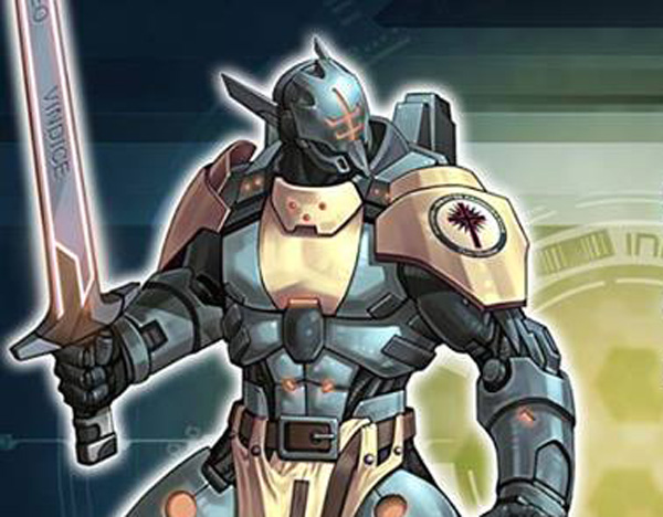
OMG I LIVE THAT SWORD DESIGN SO MUCH XD
As soon as I saw that, I was sold– instead of all-glowy swords, I wanted to do mine as flat metallic blades with the glowy bits merely being trim around the outside (though I love the visual effect of the glowy party not actually touching the edge).

To accomplish this effect, I first started out by actually painting the entire blade how I didn’t want it– as a solid-colour lightsaber, with focused glows at different points down each side of the blade.

The different colours, incidentally, reflect different types of weapons; the orange are “explosive” swords, while the green are “armor-piercing”. In theory there’s a third kind of sword that I’ll be painting eventually (but haven’t had it come up yet on any models), for which I’m thinking of using blue.

Once the glow was down, I then freehanded dark grey areas on top (going VEEEEEERY slowly to avoid skipping outside the lines, as it would be extremely hard to cover up any mistakes afterward), and finally highlighted the highest edge in lighter grey to give the flat metals some volume.

Some were less successful than others– the highlight came out really wobbly on this one. :/
Overall though, I think it’s an incredibly badass effect, and I’m proud to have stolen it so successfully. 😀

And that’s about all I have for you today, lady and gents. I have one more batch of already-painted models to share before I need to start painting more; I’ll probably get those up next weekend, and then I can turn my blogging attention to other matters…
I’m going to have to read this all again when I paint my knights – I had no idea they had that level of specifics all figured out.
I love how you’ve done the swords, and I had no idea you had free-handed the grey on until I got to the tutorial at the bottom, so well done.
Will you be bringing these guys to Templecon?
1) That level of specificity isn’t present in the core colour scheme– they all just have blue armor and whatever colour of cloth. However, that’s done with a “vanilla” army in mind where each model is meant to stand on its own. I wanted mine to feel like they were part of a cohesive whole– all having their own distinct identities, and yet all looking like they belong standing next to each other.
I like cohesion. Snowflakes upset my OCD. 😉
2) I’m glad that I won’t have to do more than half a dozen of them– it’s really hard to do, and first-try precision is not exactly my wheelhouse. 🙁
3) Yep. In fact, as part of my Warmahordes sabbatical I’m planning to make Infinity my main game at Templecon this year, assuming there are enough players there to sustain that. I’ll lug down some Grind and Thunderdome squads for random goofery, but I’m not planning on bringing any of my full army cases down if I can avoid it. 🙂